Times New Roman Font Is Back — and History Is Rolling Its Eyes
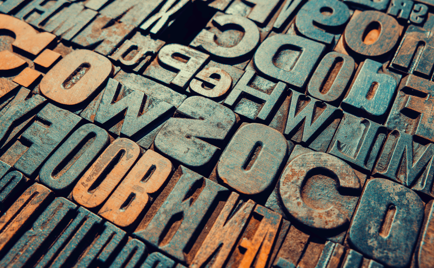
The decision by Marco Rubio’s State Department to mandate a return to Times New Roman as its official typeface and to ban the sans serif Calibri — which had been adopted by the Biden administration to be more accessible to those with reading disabilities — was but one more absurd and ignorant attack by this regime on inclusion as woke. In its chronically credulous coverage of the Trump administration, The New York Times chose to take seriously and thus elevate and normalize the State Department decree, examining the fine points of the faces’ respective designs and legibility in a weekend feature . But The Times left out one important aspect of the story: history. This is not the first time that an authoritarian regime has anointed and banned typefaces. In a most unexpected invocation of Godwin’s Law — that as any discussion continues online, the probability of comparison to Nazis approaches one — it must be noted that Hitler did it, too. He even imprisoned a typographical opponent. In my book The Gutenberg Parenthesis , I tell the story of typographical polarization in the early days of print, as there came a cultural divide between nations adopting roman or blackletter typefaces. Roman faces were heirs to the first and to my mind still the most sublimely beautiful and subtly human exemplar of the form, Jenson, created by Nicolas Jenson in Venice in 1470. Most of Europe went that way. German-speaking lands opted instead for blackletter such as that used by their favorite son, Johannes Gutenberg, who invented movable type in Mainz about twenty years earlier. His first fonts mimicked heavy scribal penmanship. (Before continuing with our story, typographers will expect me to instruct readers that a typeface is a design, such as Times New Roman, while a font is a particular size and style of it, such as 12-point condensed Times New Roman. I should also point out that blackletter is sometimes known as gothic type, as it brings to mind gothic architecture. Just to confuse the typographical noncognoscenti, gothic is also used to describe sans serif faces such as Helvetica and Calibri. But nevermind that.) Now fast forward to 1911, when the German Reichstag voted to anoint blackletter Fraktur as the official typeface of the nation. There was opposition, as some lobbied for Antiqua, a somewhat more readable and rounded variation. Choosing Fraktur was thus a matter of nationalism over internationalism. By 1928, more than half of German publications were printed with Fraktur. It instantly telegraphed Germanity and, to most of the world, was utterly unreadable. Start your day smarter. Subscribe to Wake-Up Call. Close Thank you for subscribing! Look out for our emails in your inbox soon! Email source coi_opened coi_day_of_week last_referral_date total_referrals referral_email referral_name source_detail Submit By joining you accept KCM Terms of Service & Privacy Policy Adolf Hitler required the use of Fraktur in government documents, though he was not a fan. He complained to the Reichstag in 1934 that the ornate face “does not fit...
Preview: ~500 words
Continue reading at Murmel
Read Full Article